Tumble ‘n Dry
Amstelveen, 2016
Interior Design
Tumble ‘n Dry, founded in 2007, is a Dutch children’s fashion brand with international appeal, that creates apparel for a wide age range; from babies to teens. The brand initially operated via on-line stores, and is currently making its way to the physical world, with several shop-in-shops, brand and outlet stores in The Netherlands. INAMATT developed the visual identity for the brand and the interior for the stores.
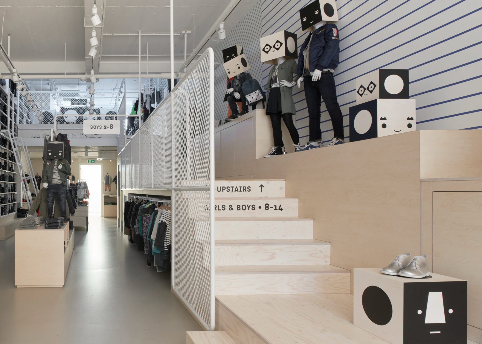
The original logo, a circle in a square, was the starting point for our concept. Different abstract faces in clear black and white form the key element of the design. We named them ‘Tumble Heads’, with their simple structure they read easily for both small kids and for grown ups. The application of the Tumble heads is versatile: from building blocks, textile prints and balloons to coffee cups and shopping bags. Tumble Heads provide a stable and highly recognizable element in the fast changing world of fashion.
In the stores a pathway is created by a tubular frame structure. Passing along the lines, a fluid way through the space is made. The tubes and visual markers create divisions between the various age departments; hiding and revealing at the same time the clothing in the different units and operate as presentation furniture. Within the store plan spaces for the different ages are easily recognized through the graphics and signing, making the stores easy to navigate both for parents and their kids.
Current shops: Amersfoort, Amstelveen, Bataviastad, Rosada, Maastricht, Breda, Haarlem, Utrecht, Tilburg, Eindhoven, Bijenkorf
Photography by Arjan Benning and Debbie van Dijk


